Advancing Your Composition Part I : Colors
Color Composition

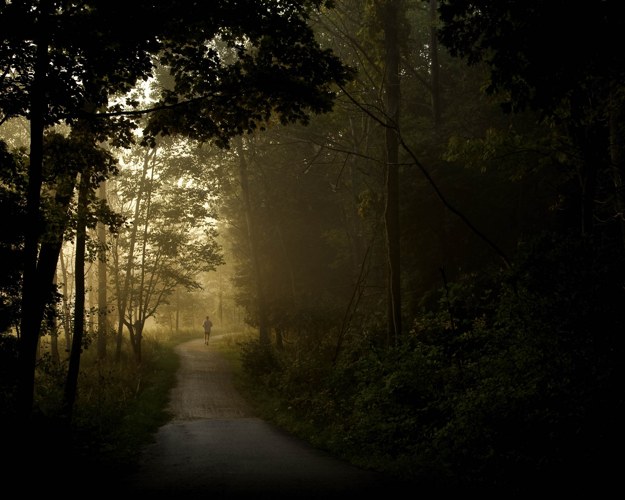
Polychromatic I – Photo Credit : Jerome Milac
Photography is an art form that is based on the same elements of composition as other art forms : Painting, Drawing, Design, even Music to some extent. Masters have broken down elements of composition to Contrast & Tone, Lines, Forms, Patterns, Balance, Textures, Movement and positive/negative space. With a lot of practice and a little talent, artists use and combine them, and try to achieve maximum strength of these elements. Like Edward Weston said, or Huntington Witherill emphasized, your visualization, then, should express the strongest way of seeing.
I dare to say, unless you’re an undisputed master of photography, that it’s almost impossible to compose with all the elements cited above. Plus, the most simple compositions, usually achieve the strongest effects. Hence, I would recommend you narrow a composition to its simplest expression, especially if you’re practicing.
Today, I’ll go over COLORS, I would recommend you choose a reasonable amount of colors. I’ve tried quite a number of colors. Actually, in my opinion, three is a very good start. In music, a harmony can already start with three notes, callled triads. So, visually, it ought to be possible to create a harmony with 3 colors. For those of you who to expand your knowledge of colors, I recommend exploring the color wheel. But for now, let’s
K.I.S. Keep It Simple.
1. Practice example
It doesn’t take a splendid landscape, or a mesmerizing sunset to compose with colors. Anything will do. So, I picked up the first color elements in my home that I could think of, as I’m writing from my kitchen-table: Colored salad bowls. I dare not to photograph them, that’s how ugly they look like in the real world. Still, they provide a few interesting colors, that will work like a charm in our practice.
So I staked them — the smaller into a larger, and placed them on a neutral background, a large black matte piece of paper. (Just to avoid any unpleasant glares)
2. Shooting preparation
2.1 Accessories
For this studio-type of shooting, I highly recommend using a tripod, just in case you’re trying out small aperture values, which usually require slower shutter speeds, which, handheld, are close to impossible to get shake-free.
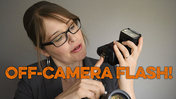
Unless you’re conducting a shoot outside, or close to a widow, vermeer style, like Bob Holmes likes to shoot with, you’re going to need a flash. Any a stand-alone flash (triggered by cable, wireless triggers or simply triggered by infrared), other than a built-in flash, might be a very good idea (Because the built-in flash usually doesn’t produce nice shadows, nor can it be directed)
At lastly, personally, I often use simple cardboards to block off interfering light sources in some situations.
2.2 Photography material
Just use any camera you have, and if you’re lucky enough to have a SLR or DLSR, ideally, get your 50mm lens ready (Any other lens or zoom above 50mm will do. You will just have to adjust to it. Like Bob Holmes repeated : “Know Your Equipment”)
3. Shooting
Here’s my advice. Don’t shoot and think afterwards. Don’t just take snapshots, make a picture. Do it, the other way round. Give your project some thinking, imagine all different viewing angles, camera distances, and light positions, and just turn around, get close, get back, play with the shadows, like a child would do. Reorganize the items, mix the colors, choose some colors, leave out others. Pretty soon, a few strong ways of seeing will stand out. That’s when you reach for your camera, adjust it on the tripod, zoom in, or out, and eventually, reach for the button to shoot.
4. Post-Processing
Once you have chosen what you believe is the strongest way of seeing, you can turn to your photo processor, and crop, enhance exposure, contrast, hue, saturation and luminance of colors, anything you want, anything you like. But in keep in mind :
You cannot improve an image that was bad to begin with : You make a photograph BEFORE you take it. A good photograph shouldn’t require a lot of post-processing. If it does, chances are, it wasn’t any good to start with, and you’re back to your project, subsequently, to your camera.
5. Examples of photographs focused on color composition

Polychromatic II – Photo Credit : Jerome Milac

Polychromatic III – Photo Credit : Jerome Milac

Polychromatic IV – Photo Credit : Jerome Milac
Finally:
Enjoy and please post your photo in our photo critique to share with others and get feedback.
Leave A Comment
You must be logged in to post a comment.